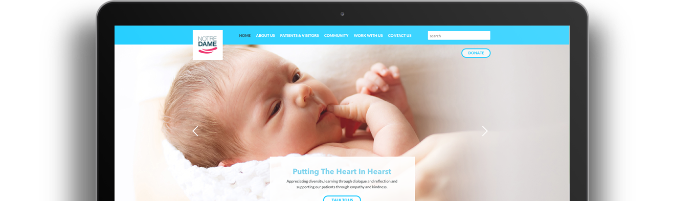
We also wanted to add important features that we felt were missing and which we felt would help the people of Hearst to have the best experience possible whilst using the site. Below is the redesign that we proposed.
Role: UX, UI & Code.
Tools: Balsamiq, Sketch, Photoshop, Illustrator, Axure, ASP.net, Bootstrap, HTML, CSS, MySQL.
Team: Shoib K, Mia E-L, Evan P, Rahul M, Jessica M.
Question
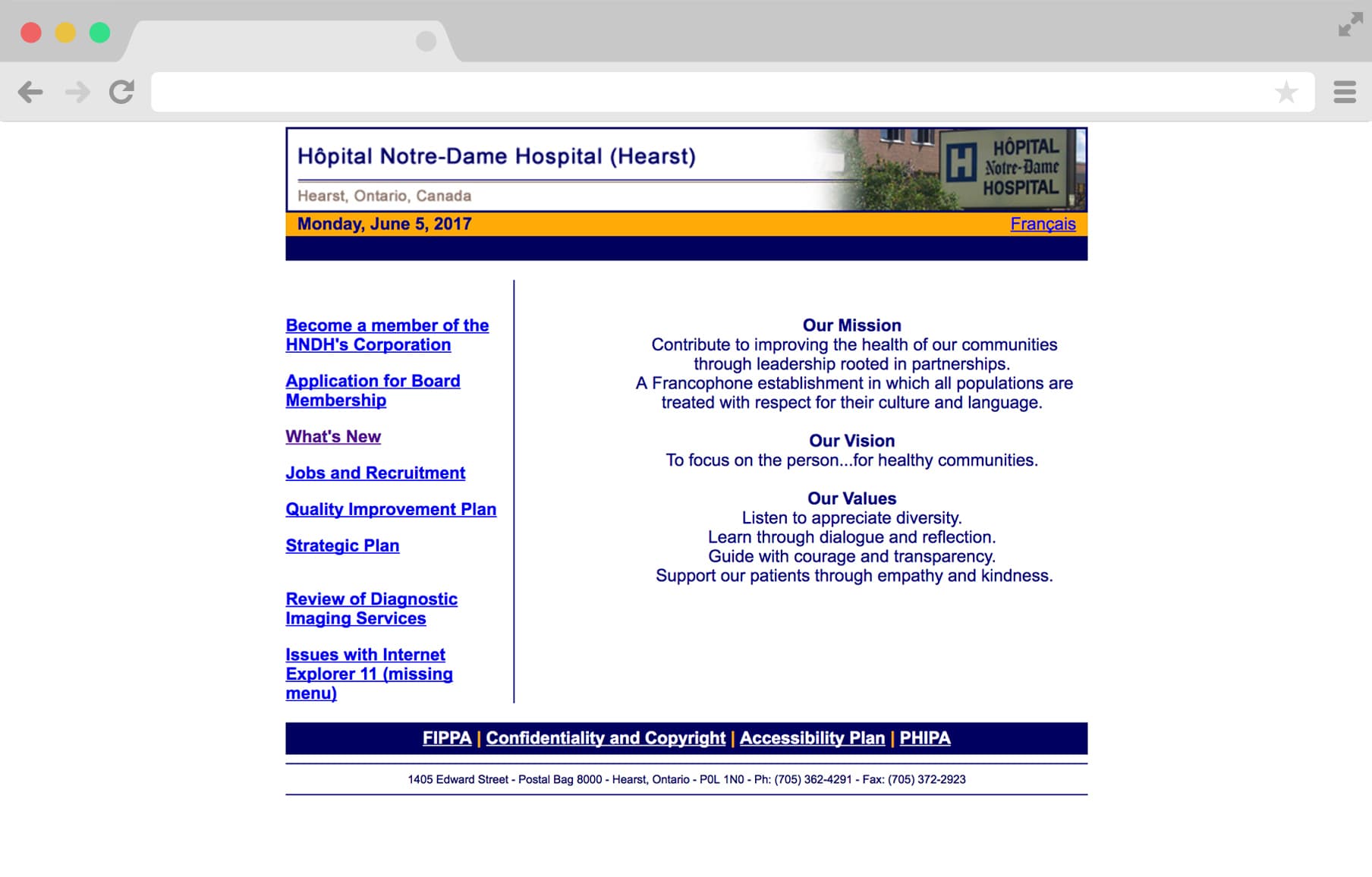
The current website (pictured above) desperately needed to be updated. The user interface was difficult to understand and inconsistent, and it was not easy to find information quickly and efficiently. Also, load times were high and unfortunatley, particularly for a hospital website, non-accessible. We want to rebuild the website from the ground up, making the site fully responsive, accessible, clear and easy to navigate whilst also cutting down on load times, particularly for mobile phone users.
"How can we make the user experience better for the people of Hearst? How can we ensure that the website looks trustworthy and evokes a sense of urgency through a well-thought-through heirarchy of information, whilst also being fast on load times and still allowing access to the large amount of information necessary?"
Phase 1 : Exploration
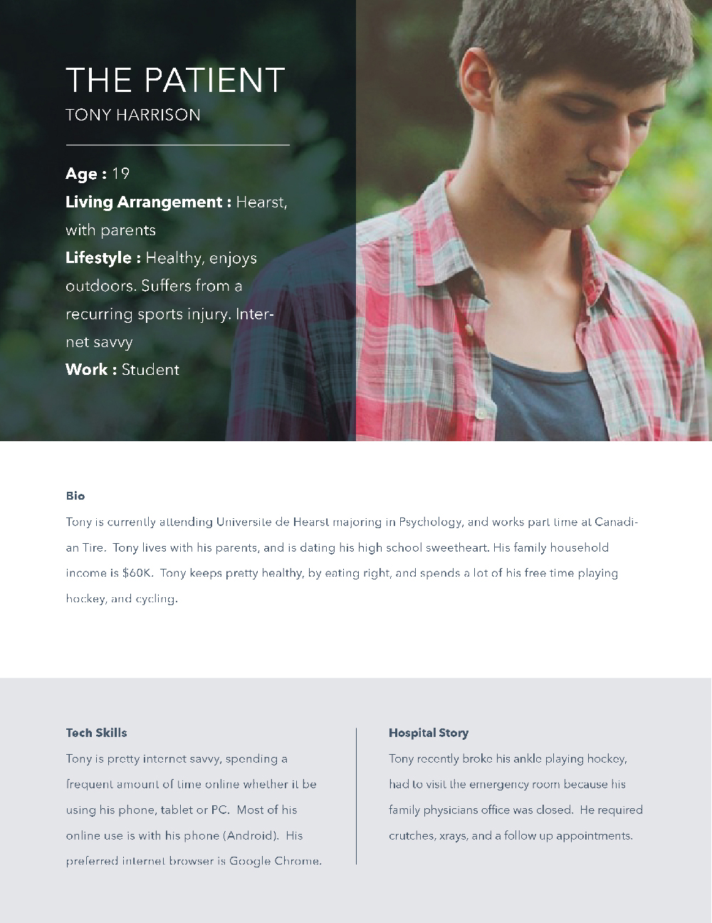
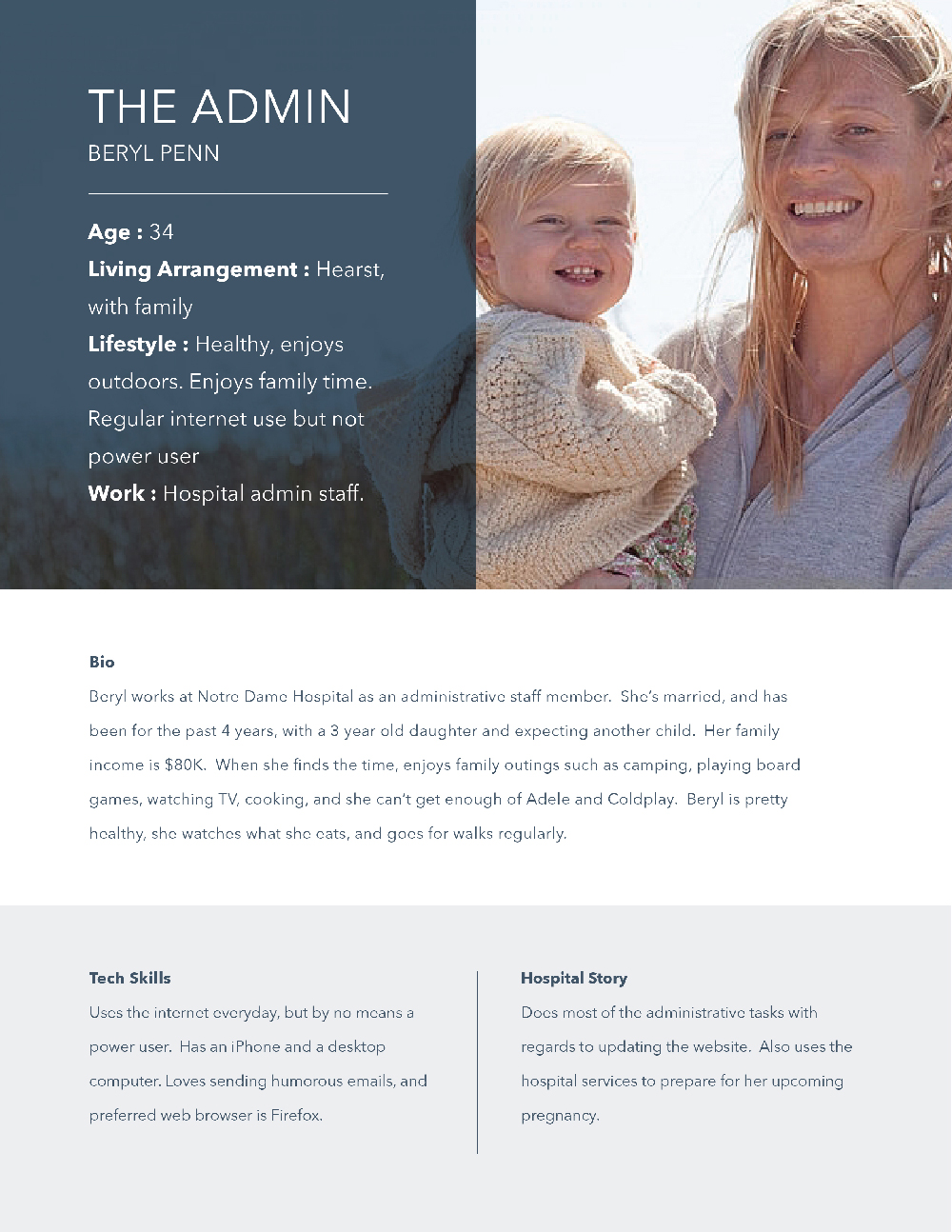
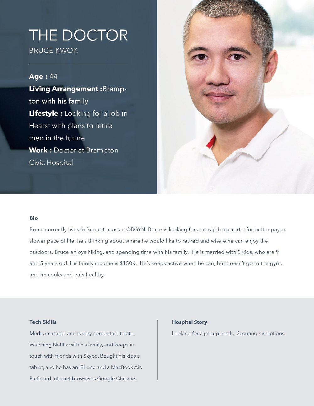
We conducted research on the demographics of Hearst and their relationship with
the hospital which raised some very interesting insights. From this we built three
main user groups, which we felt was the optimal number to help us prioritise in our
short time-frame.
Below are the 3 main personas I created. Establishing these main user-groups gave us a great reference point to work from.
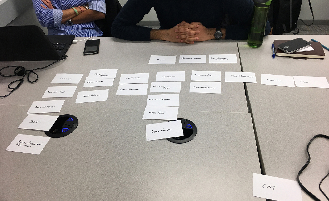
We then needed to figure out exactly what information was necessary or important to these user groups and what is not. We then needed to compile this into a heirarchy, trying to understand the needs of the people of Hearst. To also help add focus to the navigation we want to take the most important features and rebuild them in a way that they integrate well together.
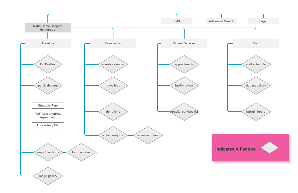
We compiled this information and built a site architecture map, describing how we felt the main key features for the website would assimilate comfortably with one another.
Phase 2 : Approach
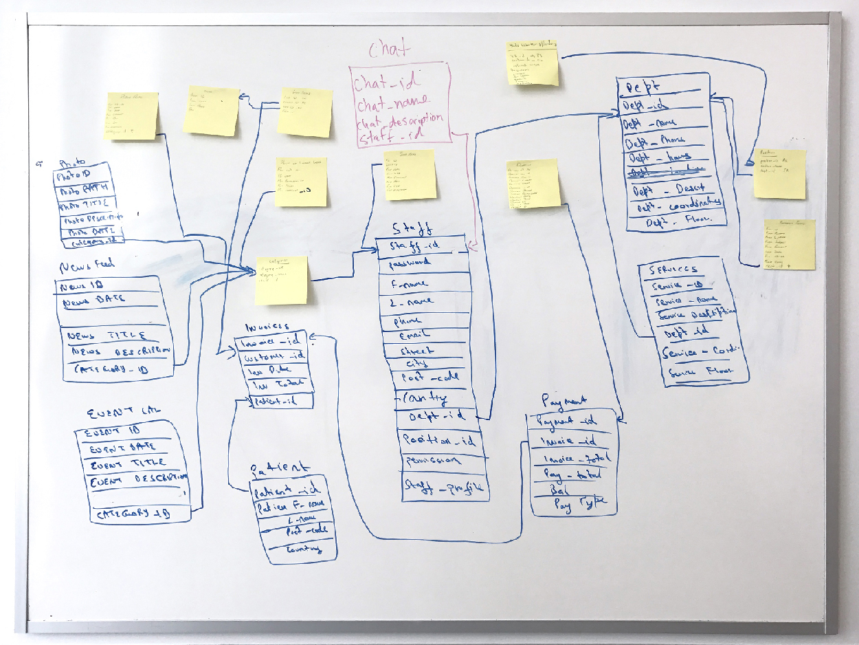
Based on our research we decided that it would benefit the hospital to build a staff portal and content management system. This way there would be staff as well as visitors using the website. In addition we would add a robust appointment booking system for referring physicians, based on the needs of our external doctor persona.
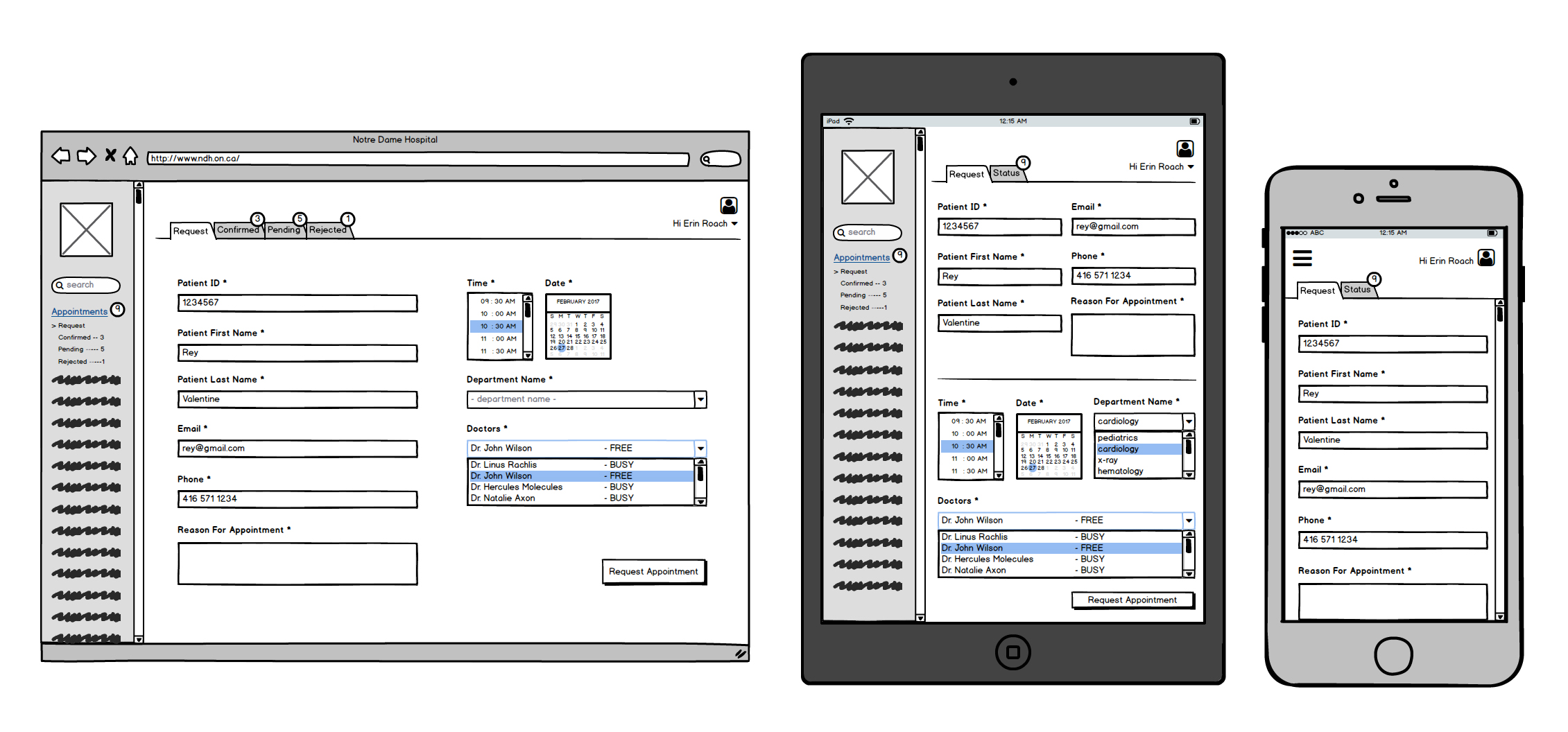
Below is an example of some of the wireframes produced.
We also discovered that due to low internet bandwith and lack of 3G coverage in some areas of Hearst, load times on the mobile site, especially, would need to be as low as possible. This would mean using less imagery and extra frills that may otherwise slow it down.
We also wanted to use visual language to craft the website in a way that was very much user focussed, using language, fonts, colours and imagery that made people feel as though by engaging with Hearst, they would feel a sense of community, acceptance and comfort.
Phase 3 : Execution
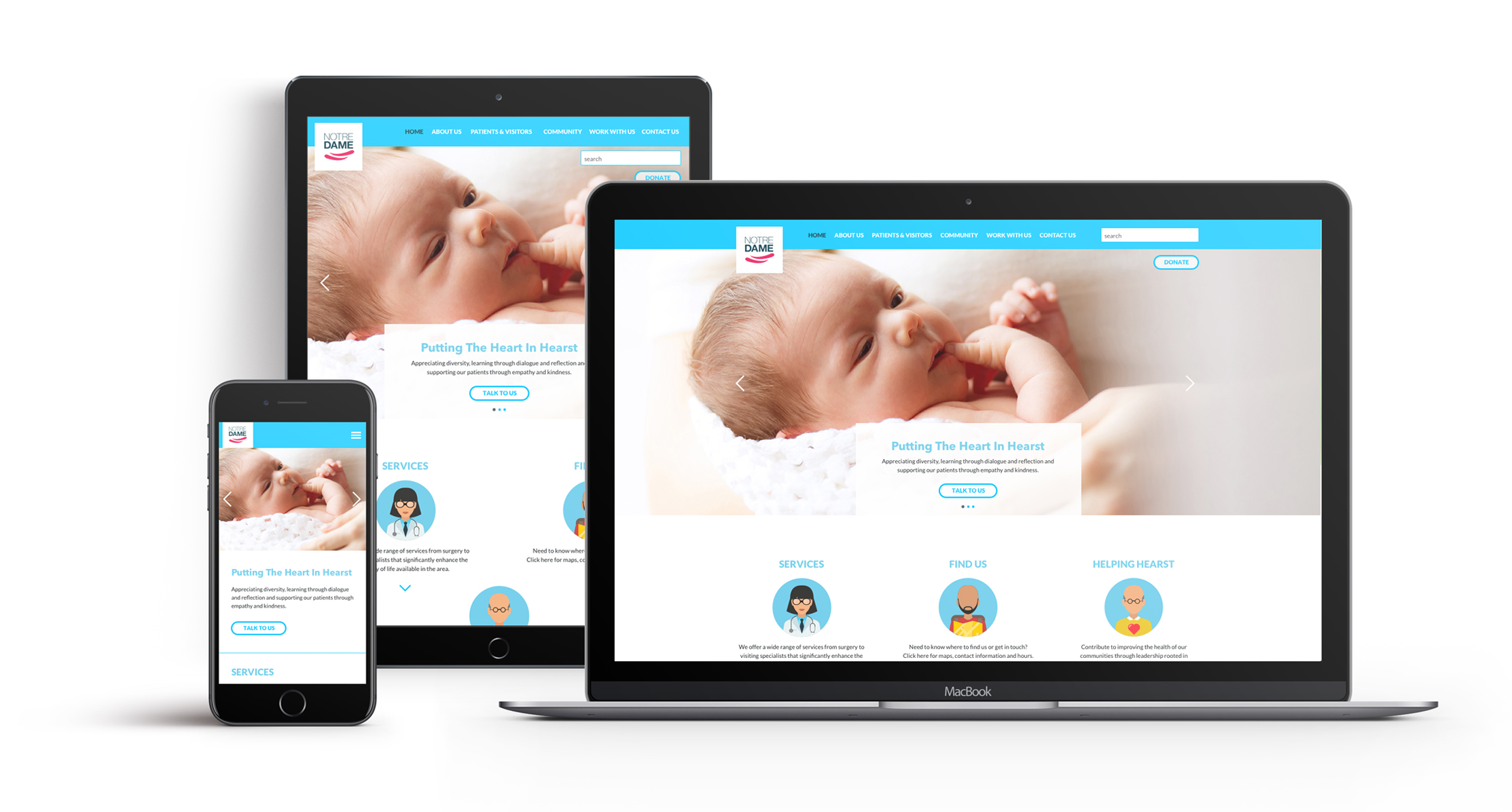
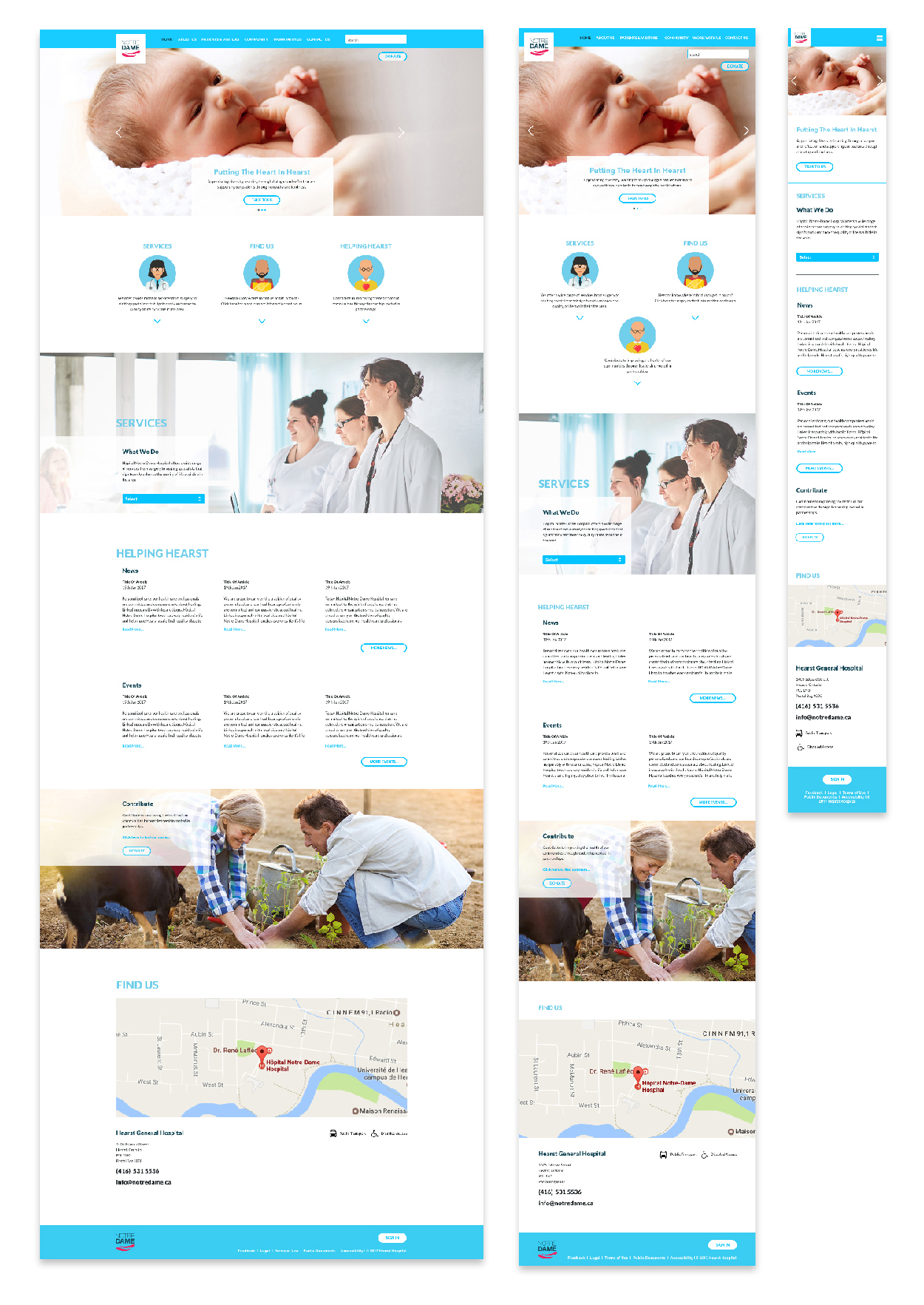
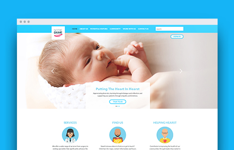
Below is the final design. It is fully responsive and works on desktop, tablet and mobile to allow use accross multiple platforms. The mobile version is also designed to be built differently to reduce load times by removing extra unnecessary images.
Overal, whilst this is still a work in progress, I am quite happy with the design and am looking forward to start programming it in asp.net.